This is day 5 of "One CSV, 30 stories":http://blog.whatfettle.com/2014/10/13/one-csv-thirty-stories/ a series of articles exploring "price paid data":https://www.gov.uk/government/statistical-data-sets/price-paid-data-downloads from the Land Registry found on GOV.UK. The code for this and the other articles is available as open source from "GitHub":https://github.com/psd/price-paid-data
I'm falling behind on the schedule to write a post each day thanks to falling into a time sink hand-coding PostScript code to generate axes. As fun as that was, it wasn't helping us towards the goal of better understanding the data. I had literally lost the plot. Returning to the brief, the scatter plots from "yesterday":http://blog.whatfettle.com/2014/10/17/one-csv-thirty-stories-4-scattering/ need axes to understand when the dips occurred and at at what price the horizontal bands are at.
So time to break out "gnuplot":http://gnuplot.sourceforge.net/ a great package for generating charts from scripts. I found "gnuplotting.org":http://www.gnuplotting.org/ extremely helpful when it came to remembering how to drive this venerable beast, and trying to fathom new features for transparency:
bc. #!/usr/bin/env gnuplot
set terminal png \
font "helvetica,14" \
size 1600,1200 \
transparent truecolor
set output "/dev/stdout"
set key off
set xlabel "Date"
set xdata time
set timefmt "%Y-%m-%d"
set xrange ["1994-10-01":"2015-01-01"]
set format x "%Y"
set ylabel "Price paid (£)"
set yrange [0:300000]
set format y "%.0s%c"
set style circle radius 100
plot "/dev/stdin" using 1:2 \
with circles lc rgb "black" fs transparent solid 0.01 noborder
Ignoring the outliers, and digging into the lower popular prices:
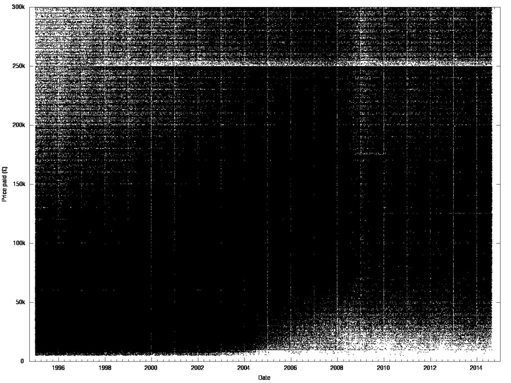
The axes help us confirm the dip of the recession in 2009, and reveals seasonal peaks in summer and strong vertical gaps each new year. Horizontal bands show how property prices bunch between round numbers. Prices below 50k start to disappear from 2004, and skip around "stamp duty bands":http://www.stampdutyrates.co.uk/historic-rates.html, particularly noticeably at £250k and £60k, which was withdrawn in 2005 when the gap closes, and then opens up again at £125 which was introduced in 2006. Finally, there's a prominent gap to correlate with the £175k band which ran between 2008 and 2010.
The seasonal trends are worth exploring further, but I think we first need to dig deeper into the horizontal banding, so I'm 82.3% confident "tomorrow":http://blog.whatfettle.com/2014/10/19/one-csv-thirty-stories-6-prices/ will be "Talk like a statistician day".