This is day 8 of "One CSV, 30 stories":http://blog.whatfettle.com/2014/10/13/one-csv-thirty-stories/ a series of articles exploring "price paid data":https://www.gov.uk/government/statistical-data-sets/price-paid-data-downloads from the Land Registry found on GOV.UK. The code for this and the other articles is available as open source from "GitHub":https://github.com/psd/price-paid-data
"Yesterday's":http://blog.whatfettle.com/2014/10/20/one-csv-thirty-stories-7-prices-redux/ post was now four days ago and whilst I've a number of excuses for losing momentum, the main reason was trying to make this post interesting. I'd let wanting something great become the enemy of the "probably good enough":http://en.wikipedia.org/wiki/Perfect_is_the_enemy_of_good.
A few people suggested a "heat map":http://en.wikipedia.org/wiki/Heat_map rather than a scatter plot might shed some light on prices. A heat map means grouping values over a time period as well as range of values. The gnuplot "image plot":http://gnuplot.sourceforge.net/demo/heatmaps.html takes XYZ values with rows separated by blank lines. For prices this means collating lines of date, price, counts as follows:
bc. 1995-01 0 0
1995-01 1 94
1995-01 2 244
1995-01 3 506
...
1995-02 0 0
1995-02 1 169
1995-02 2 493
1995-02 3 1007
...
We need something to turn the date, price pairs we created for the "scatter plot":http://blog.whatfettle.com/2014/10/17/one-csv-thirty-stories-4-scattering/ If this was 1986 I'd use "some APL":http://ngn.github.io/apl/web/#code=20%205%203%20%u2374%20%u2373%20250 :
bc. 20 5 3 â´ â³ 250
but APL is hard to find these days, harder to share with others, so here's some logic in awk:
bc. function print_prices(date, counts) {
for (price= 0; price <= price_max; price++) {
count = counts[price];
if (!count) {
count = 0;
}
printf "%s %d %d\n", date, price, count;
}
printf "\n";
}
BEGIN {
FS=" "
price_unit = 1000000;
price_max = 60;
}
{
lines++;
date = $1;
sub("-[0-9][0-9]$", "", date);
price = $2 / price_unit;
counts[price]++;
if (date_last && date_last != date) {
print_prices(date_last, counts);
lines = 0;
delete counts;
}
date_last = date;
}
END {
if (lines) {
print_prices(date_last, counts);
}
}
Which groups prices into month by £1 million squares, giving:
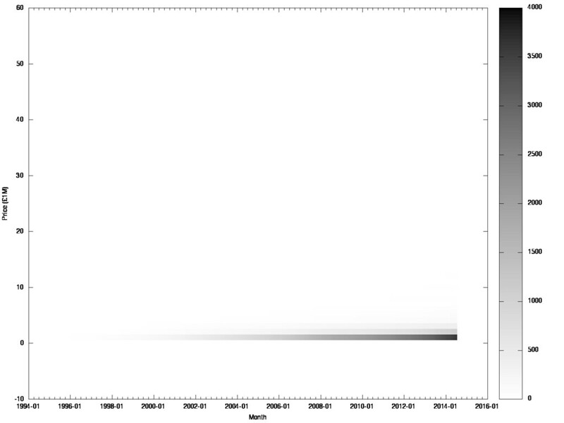
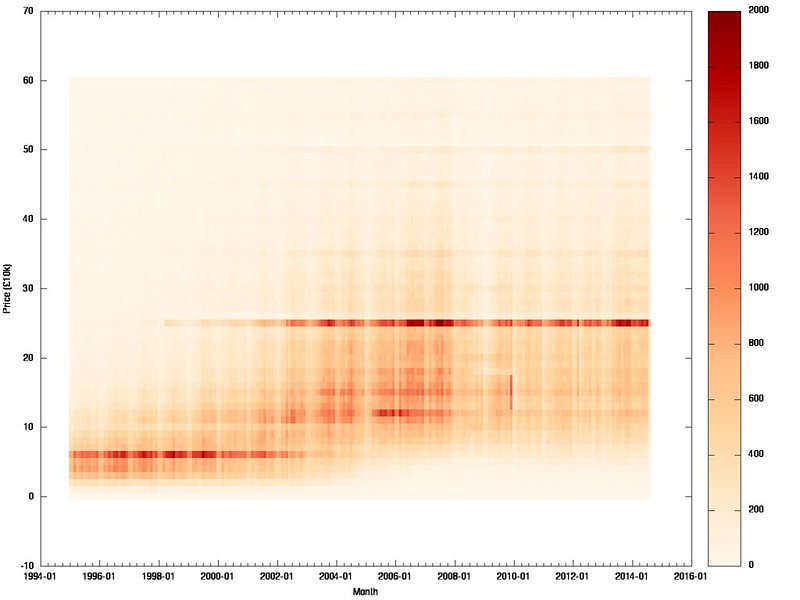
A complete picture, but a little flat. Drilling in again to prices £0-600k and experimenting with units going from £1k, £10k, £25k, £50k, £100k gives a range of charts:

I've been creating monochrome charts mostly because I like monochrome and good colour design is difficult, but "colorbrewer":http://colorbrewer2.org/ exists to create heatmap palettes, which we can apply to gnuplot as follows:
bc. set palette defined (\
0 '#fff7ec',\
1 '#fee8c8',\
2 '#fdd49e',\
3 '#fdbb84',\
4 '#fc8d59',\
5 '#ef6548',\
6 '#d7301f',\
7 '#b30000',\
8 '#7f0000')
plot '/dev/stdin' using 1:2:3 with image
leading towards a more interesting version of the £10k banded price heatmap:
I need to pick up the pace if I'm to meet the 30 posts in 30 days, and think there's at least a couple more things to say about prices tomorrow, which will hopefully actually happen "tomorrow":http://blog.whatfettle.com/2014/10/28/one-csv-thirty-stories-9-yearly/!