This is day 19 of "One CSV, 30 stories":http://blog.whatfettle.com/2014/10/13/one-csv-thirty-stories/ a series of articles exploring "price paid data":https://www.gov.uk/government/statistical-data-sets/price-paid-data-downloads from the Land Registry found on GOV.UK. The code for this and the other articles is available as open source from "GitHub":https://github.com/psd/price-paid-data
"Yesterday":http://blog.whatfettle.com/2014/11/20/one-csv-thirty-stories-18-choropleth/ I made a simple choropleth map of average prices. Today I wanted to iterate on this hack. Once again this took me longer than expected, this time because I didn't like the results.
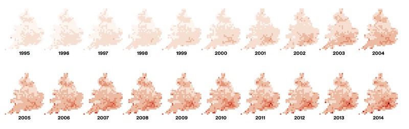
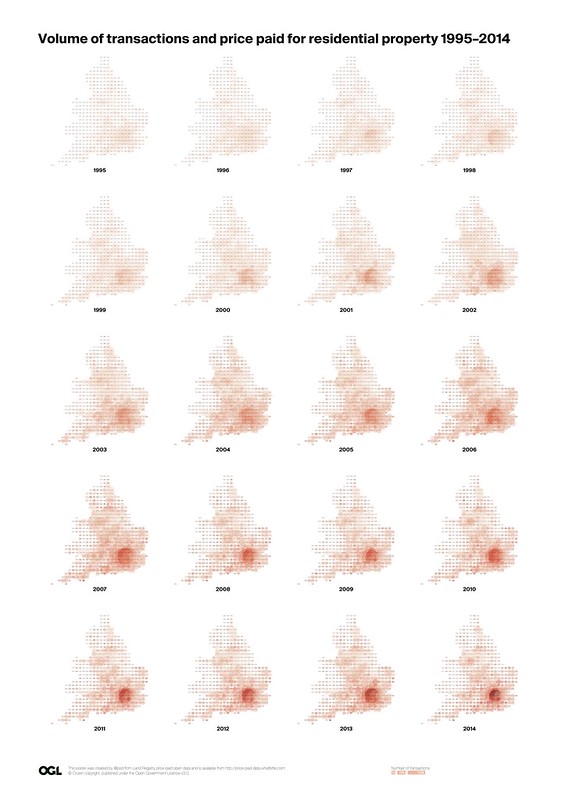
First-off it was a little remiss of me not to call out one of the design decisions in yesterday's post. The colours are scaled across the entire range of yearly maps, illustrating how house prices have hotted up over twenty years. There is an alternative to scale the prices within each year to show how the distribution of prices have moved over twenty years:
I wondered about changing the squares to match the Land Registry's marvellously retro logo:

This wasn't too tricky thanks to the "CSS tricks":http://jtauber.github.io/articles/css-hexagon.html outlined by "James Tauber":http://jtauber.com/ which uses adjacent blocks with enlarged boarders to create a mesh of hexagonal divs which tessellate across a plane:
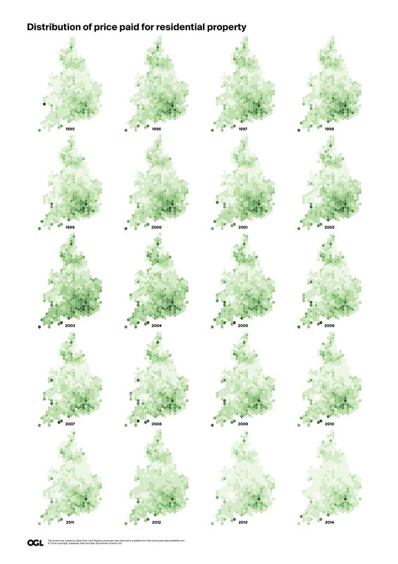
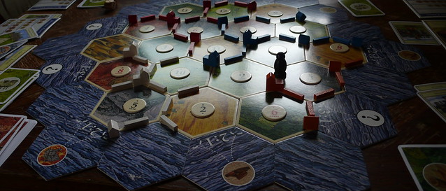
Using the grid values with these shapes was a bit of cheat; I really should have recalculated the averages based on the geometry of each hexagon, and worked harder to make them work in any browser beyond Firefox and Chrome, but this experiment was enough to convince me I really didn't like the look of where the hack was heading. Hexagons are just not my bag, unless I'm playing Settlers of Catan:.
So I decided to try a different tack and experimented with turning each square div into a circle using a single line of CSS:
bc. .circle { border-radius: 50% }
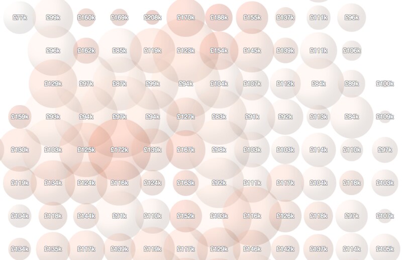
I then resized each div to show both the average price and number of transactions for each postcode:
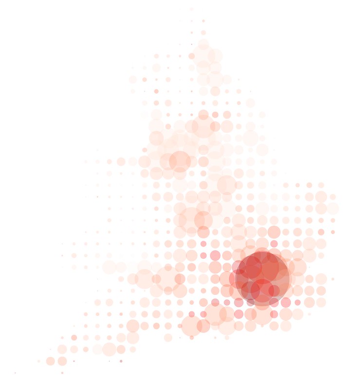
This looked more promising, but not great, so I played quite a bit, experimenting with the size, shape and colour of the bubbles:
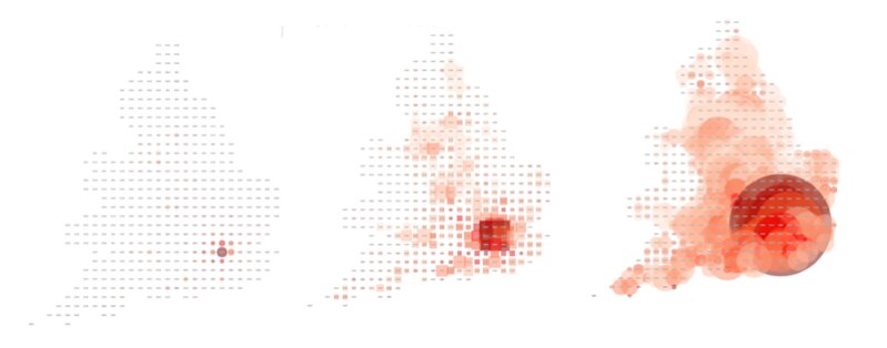
The biggest difficulty was finding a way of revealing the map, illustrating the massive difference in the price-paid and number of transactions within London as opposed to the immediately surrounding area. A logarithmic scale might have helped, but in the end I settled on spheres, which meant taking the cubed-root of the number of transactions at each postcode and applying a small amount of border-shadow on each sphere:
I continued to try, but couldn't get this visualisation to work. I elected to make the spheres transparent, but that created darker colours when bubbles overlap, which say nothing about the price at that location, and blurs both the discrepancy in the number of transactions and the price which can vary greatly in adjacent postcodes:
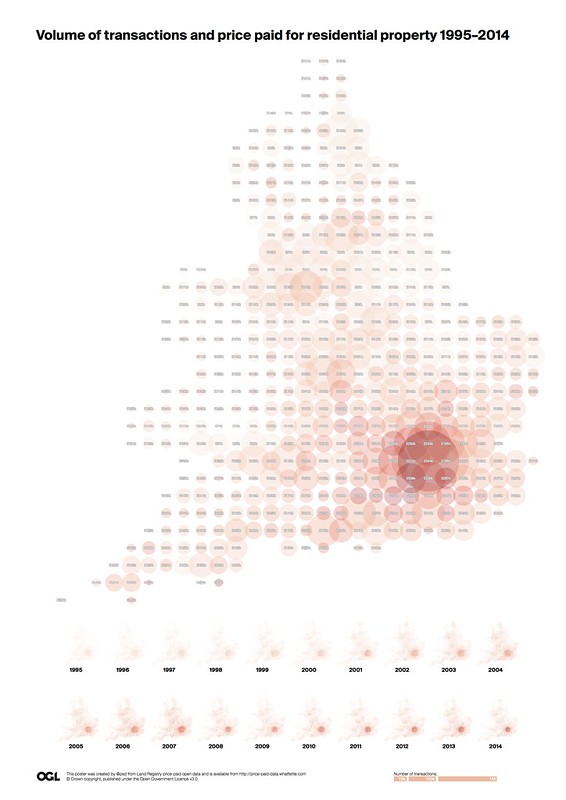
And, as mentioned previously, transparency and gradients don't work well in postscript, making the resultant PDFs large and unprintable. So I spent even more time futzing with this page, trying to flog a dead-tree, to no avail:
Literally the bottom line: today I iterated wildly, but failed to improve on "yesterday":http://blog.whatfettle.com/2014/11/20/one-csv-thirty-stories-18-choropleth/. I should probably move along, but I've still at least one more idea I want to try out with this data "tomorrow":http://blog.whatfettle.com/2014/11/27/one-csv-thirty-stories-20-unknown-prices/.